Enhancing CUIMC's Digital Presence

Digital Strategy & Web Services
Websites, Marketing, and Social Media for CUIMC
Our team of designers, developers, and marketers can help you:
- Build, manage, and support CUIMC websites with content optimized for SEO and high conversions.
- Create engaging digital marketing campaigns to drive traffic to our content and achieve our goals.
- Manage and coordinate social media campaigns to raise awareness about our services, providers, and patient experience.
A Unified Digital Presence

Learn more about building pages on CUIMC sites, optimizing content for search engines, creating an original marketing campaign, and expanding your social media audience.
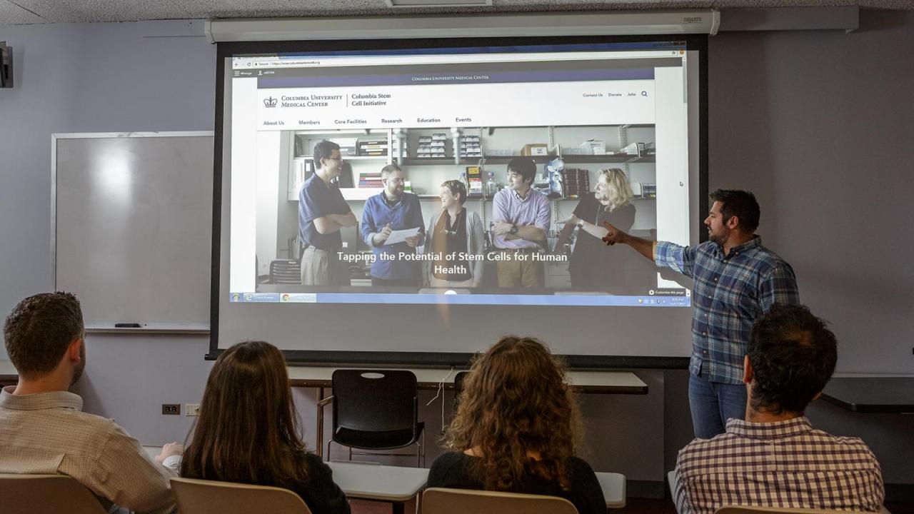
View Our Work
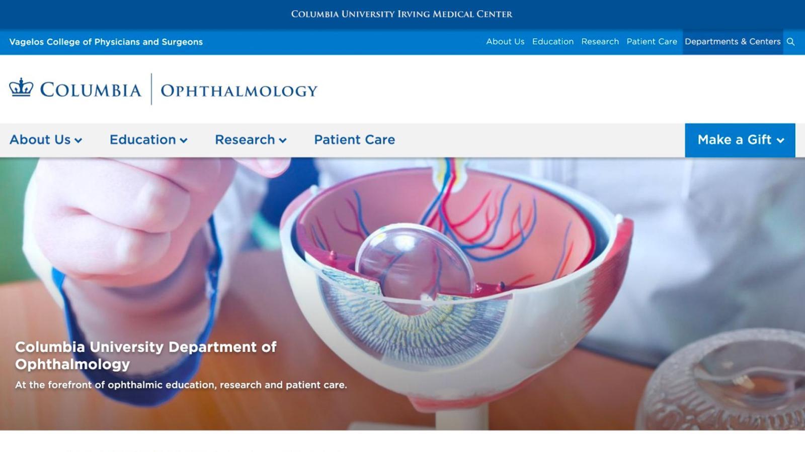
See examples of our work including faculty profiles, clinical and academic departmental websites, and social media campaigns.
Training Schedule
- Thursday, April 25, 202410:00 AM to 12:00 PM
Venue
Online Zoom - Wednesday, May 1, 20243:00 PM to 4:00 PM
Venue
Online Zoom - Thursday, May 9, 202410:00 AM to 12:00 PM
Venue
Online Zoom - Wednesday, June 5, 20243:00 PM to 4:00 PM
Venue
Online Zoom